Why a color Kobo matters more than it sounds
You can read novels perfectly well on a cheaper black-and-white e‑reader, so color can sound like a gimmick. The practical difference shows up in the small moments: a cover that’s easier to spot in your library, highlights that are meaningfully color-coded for study, and charts or maps that don’t collapse into the same gray tone. Color e‑ink also changes how you think about “one device” for mixed reading—novels, reference books, and the occasional comic—without switching to a tablet.
The catch is that color e‑ink usually asks for compromises. You may see slightly darker whites, a touch less crisp text, and slower page turns than the fastest monochrome screens, and color models typically cost more. The value question isn’t “is color pretty,” but “will you use it often enough to justify the trade-offs.”
What the Clara Colour changes in everyday reading
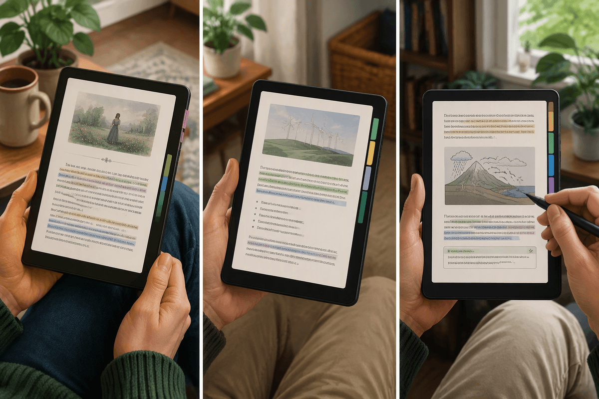
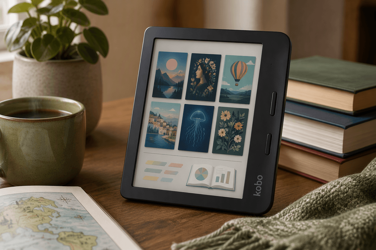
Think about a normal week of reading: you’re bouncing between a novel at night, an article saved as an EPUB, and a nonfiction book with the occasional diagram. On the Clara Colour, the biggest day-to-day shift is organization and annotation. Covers are easier to scan at a glance, and if you highlight a lot, separate colors make it faster to “read your own notes” later—quotes in one color, definitions in another, questions in a third.
Color also helps when a book quietly depends on visuals. A map, a legend, or a simple chart stays legible without you squinting at similar shades of gray. The trade-off shows up right alongside that convenience: the page looks a bit more like off-white paper than bright white, and pure text can feel slightly less crisp than a great black-and-white screen.
Reading comfort: brightness, clarity, and long sessions
If you read for long stretches, comfort comes down to two things: how “paper-like” the page looks in your lighting, and how hard the device makes your eyes work. On the Clara Colour, the screen can look a little dimmer than a comparable black-and-white Kobo because the color layer reduces contrast. That doesn’t mean it’s hard to read, but it does mean you may use the front light more often—especially indoors or on cloudy days—which can slightly shrink the relaxed, zero-glare feel people buy e‑ink for.
Text clarity is still good for novels, but tiny fonts and very thin typefaces can feel less snappy than on a sharp monochrome panel. If you’re sensitive to that, bumping font weight or stepping up one size usually fixes it. The practical cost is simple: more light and heavier fonts can make the page feel “busier,” even when your eyes are comfortable.
Comics, illustrated books, and PDFs: where it shines
If you read comics or illustrated books, color is where the Clara Colour stops feeling optional. Panel borders, speech bubbles, and scene cues are easier to parse than on grayscale, and subtle palette changes that signal a flashback or mood shift don’t flatten into the same tone. It’s also a real upgrade for cookbooks, travel guides, and textbooks with diagrams, where “good enough” visuals save you from pulling out a phone.
PDFs are the more mixed story. On a 6-inch screen, full-page PDFs often force zooming and panning, and color e‑ink won’t fix a layout that was designed for letter-size paper. If your PDFs are reflowable or already sized for small screens, it’s pleasant; if they’re scanned pages or dense two-column documents, the workflow can feel slow and fiddly.
Your books, your library: Kobo store, OverDrive, formats
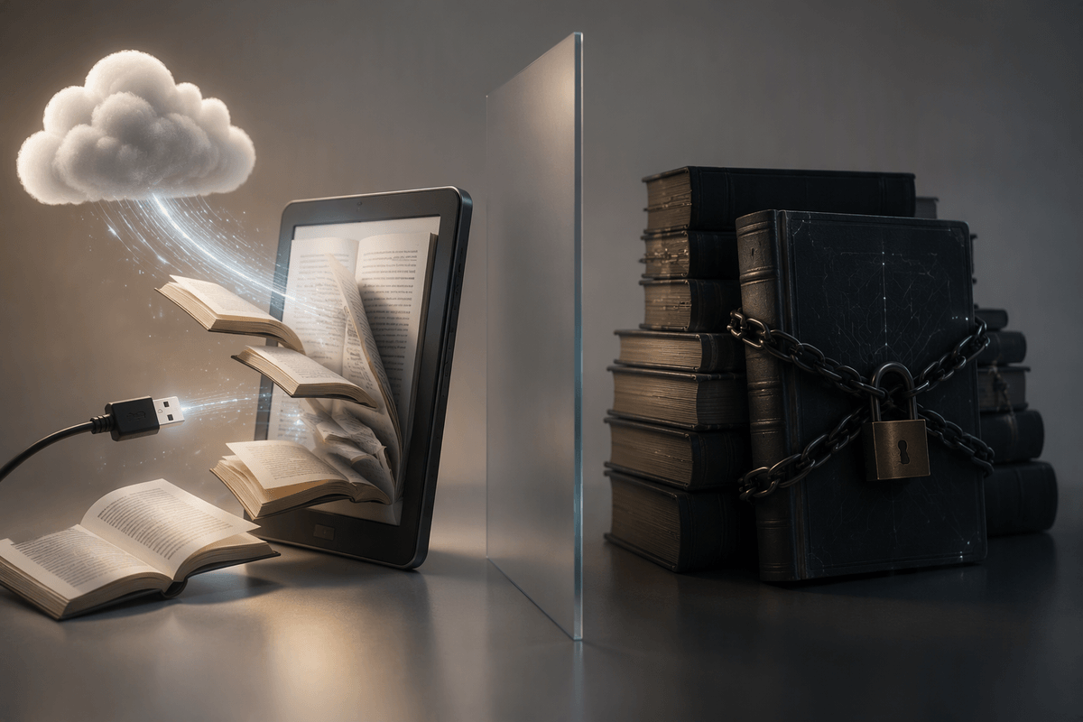
The real make-or-break is whether your books flow in without friction. Kobo’s store is solid for mainstream ebooks and frequent sales, and it plays nicely with series management and syncing your reading position across Kobo apps. For many U.S. readers, OverDrive library borrowing is the headline feature: you can sign into your library account and browse, borrow, and read without doing the “download on a computer, transfer, eject” routine.
Format support is another quiet advantage. Kobo handles EPUB and EPUB3 well, plus PDFs (with the small-screen limits you’ve already felt), and it can sideload files by USB or send them with common tools. The constraint is DRM: books locked to another ecosystem—especially many Kindle purchases—usually won’t move over cleanly, so switching can mean repurchasing some favorites.
Battery life and speed: the trade-offs to check
Battery life is where color e‑ink’s “small compromises” show up in a way you’ll actually notice. Because the color layer lowers contrast, many people run the front light a bit higher than they would on a crisp black-and-white Clara. That extra light usage, plus heavier highlighting and more time in image-heavy books, can turn “weeks between charges” into “days to a couple weeks,” depending on how you read. If you mainly read plain-text novels at low brightness, you’ll do much better than someone bouncing through comics and PDFs on a brighter setting.
Speed is similar: fine for page-to-page novel reading, but less satisfying when you’re doing lots of navigation. Color screens typically refresh more slowly, and you may see more noticeable screen flashes during full refreshes, especially when switching between mixed graphics and text. The practical test is simple: if your reading involves frequent zooming, panning, and jumping between sections, that friction can matter more than the color itself.
Is it a must-have for you or a nice-to-have?
You’ll feel the Clara Colour as a must-have if your reading regularly includes things that depend on color: comics, illustrated nonfiction, cookbooks, maps, charts, or heavy highlighting where color-coding saves time later. In those cases, the trade-offs (a slightly dimmer page, a bit less “snap” in text, and some extra front-light use) buy you clarity and organization you’ll use every week.
It’s more of a nice-to-have if you’re 90% novels, you read small fonts, and you care most about maximum contrast, fastest page turns, and the longest battery between charges. A good black-and-white Clara will usually feel cleaner for pure text, and it costs less. The deciding question is simple: will color change what you comfortably read on the device, or just make what you already read look a little nicer?
Buying and setup tips to make it feel magical fast
Buy from a retailer with an easy return window, because the “is the page too dim?” question is personal and hard to judge from reviews. If you can, compare it side-by-side with a monochrome e‑reader in your usual lighting and at your usual font size. On day one, set your preferred font, bump weight slightly if text feels soft, and dial in the front light and color temperature for night reading.
Then make it frictionless: sign into OverDrive immediately, pin your library, and import a small test set (one EPUB novel, one illustrated book, one PDF) to learn what looks great and what feels slow. Expect a little tinkering—especially with PDFs—but once the basics are set, it disappears into the background.